
In today’s data-driven world, the ability to analyze and interpret data is a crucial skill. Microsoft Excel, with its powerful features and user-friendly interface, remains one of the most popular tools for data analysis. This comprehensive tutorial will guide you through the process of conducting data analysis in Excel, from importing data to creating insightful visualizations.
Without taking much of your time, let’s dive into it. The first step we need to do before starting our analysis is data importation.
Importing and Preparing Your Data:
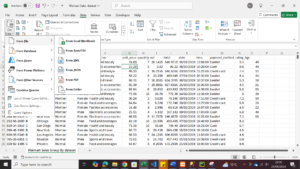
Every dataset we need to analyse to get insight first needs to be imported into Microsoft Excel Spreadsheet from whatever source you are getting your data from. Data importation is the process of opening a dataset in an Excel workbook. After importing your dataset, the next step is to prepare the file; getting the file ready for analysis. This is also known as data cleaning. So in this phase, you check for missing values, duplicate contents, wrong spellings, and so on.
Here is how to import data in excel
- Open Excel and click on the “Data” tab
- Choose “Get Data” > “From File” > “From Text/CSV.”
- Select your data file and click “Import.”
- In the preview window, ensure data types are correctly identified
- Click “Load” to import the data into your worksheet
1.2 Data Cleaning
After importing data, the next step is data cleaning, this is where you prepare your data to make sure it is accurate for analysis, this step must be properly done in other to get correct insight from data. so as a data analyst, you must learn to clean your data properly and thankfully, excel makes data cleaning quite easy. below are steps on how to clean a dataset in excel.
1. Remove duplicate entries:
It is very important you remove duplicates in your dataset. Here are the steps to remove duplicates in Excel:
1. Select your data range
2. Go to “Data” > “Remove Duplicates.”
3. Choose the columns to check for duplicates and click “OK.”
4. Handle missing values:
5. Use “Find & Select” > “Go To Special” > “Blanks” to locate empty cells
6. Decide whether to delete rows with missing data or fill in the blanks with appropriate values
1.3 Formatting Data
1. Ensure consistent formatting across columns (e.g., dates, numbers)
2. Use “Format Cells” to set appropriate number formats
3. Consider creating a table: Select your data and press Ctrl + T
2. Exploratory Data Analysis
Data exploration is the process of reviewing dataset to gain insight. There are different methods used in exploring data in data analysis.
2.1 Descriptive Statistics
This is a tool found in excel. it is used to give a brief description of what the dataset is about. Here is how to use this tool in Excel.
1. Use the “Descriptive Statistics” tool:
2. Go to “Data” > “Data Analysis” (if not visible, enable Analysis ToolPak in Excel Add-ins)
3. Choose “Descriptive Statistics” and select your input range
4. Check “Summary statistics” and click “OK.”
5. This provides mean, median, standard deviation, and other key statistics
2.2 Pivot Tables
Another method for exploring dataset in excel is the use of pivot table. Here is how to use a pivot table for data exploration in Excel.
Create a Pivot Table:
1. Select your data range
2. Go to “Insert” > “PivotTable.”
3. Choose fields for rows, columns, and values
4. Use Pivot Tables to summarize data and identify patterns quickly
2.3 Creating Basic Visualizations in Microsoft Excel
1. Create a histogram:
2. Select a column of data
3. Go to “Insert” > “Insert Statistic Chart” > “Histogram.”
4. Create a scatter plot:
5. Select two columns of data
6. Go to “Insert” > “Scatter.”
7. These visualizations help identify distributions and relationships in your data
Here are Some Data Visualization Best Practices
1. Bar charts: Compare categories
2. Line charts: Show trends over time
3. Pie charts: Display parts of a whole (use sparingly)
4. Scatter plots: Illustrate relationships between variables
Conclusion
Excel is a powerful tool for data analysis, capable of handling a wide range of tasks from basic calculations to complex statistical modeling. By mastering these techniques, you’ll be well-equipped to extract valuable insights from your data.
Remember, effective data analysis is not just about using the right tools—it’s about asking the right questions and interpreting results critically. As you practice these skills, you’ll develop a keen analytical mindset that will serve you well in any data-driven field.
Keep exploring Excel’s features, stay curious, and don’t hesitate to experiment with your data. Happy analyzing!

I loved how this article simplified a complex topic!
The site’s overall organization makes finding great articles easy.
A very interesting and informative read! This site consistently shares
high-quality and useful articles.
hi